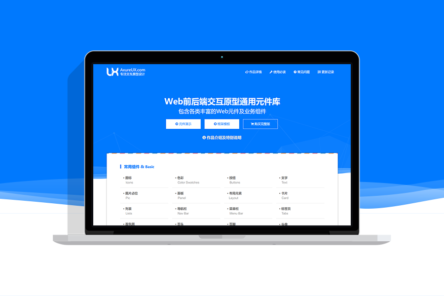
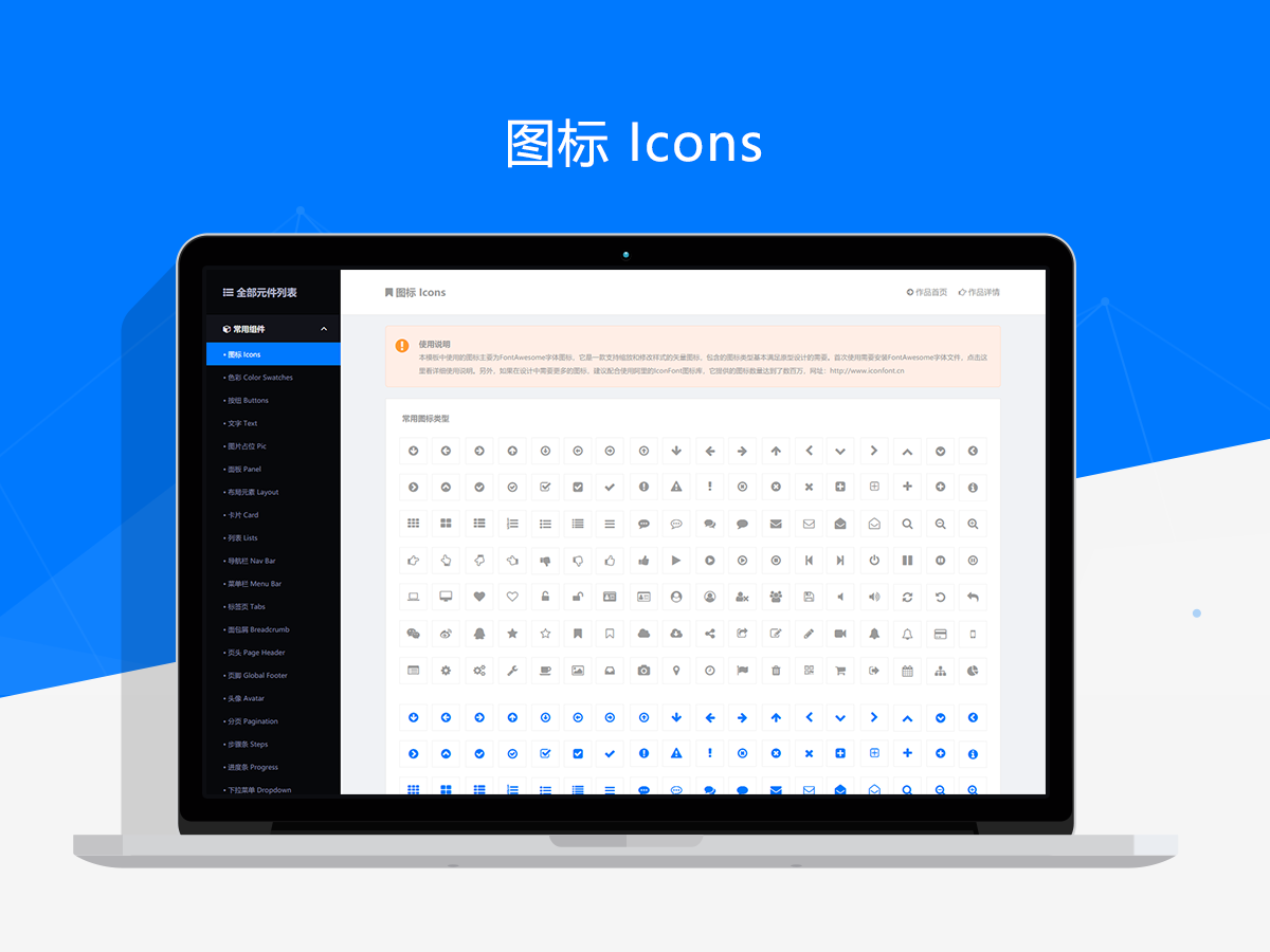
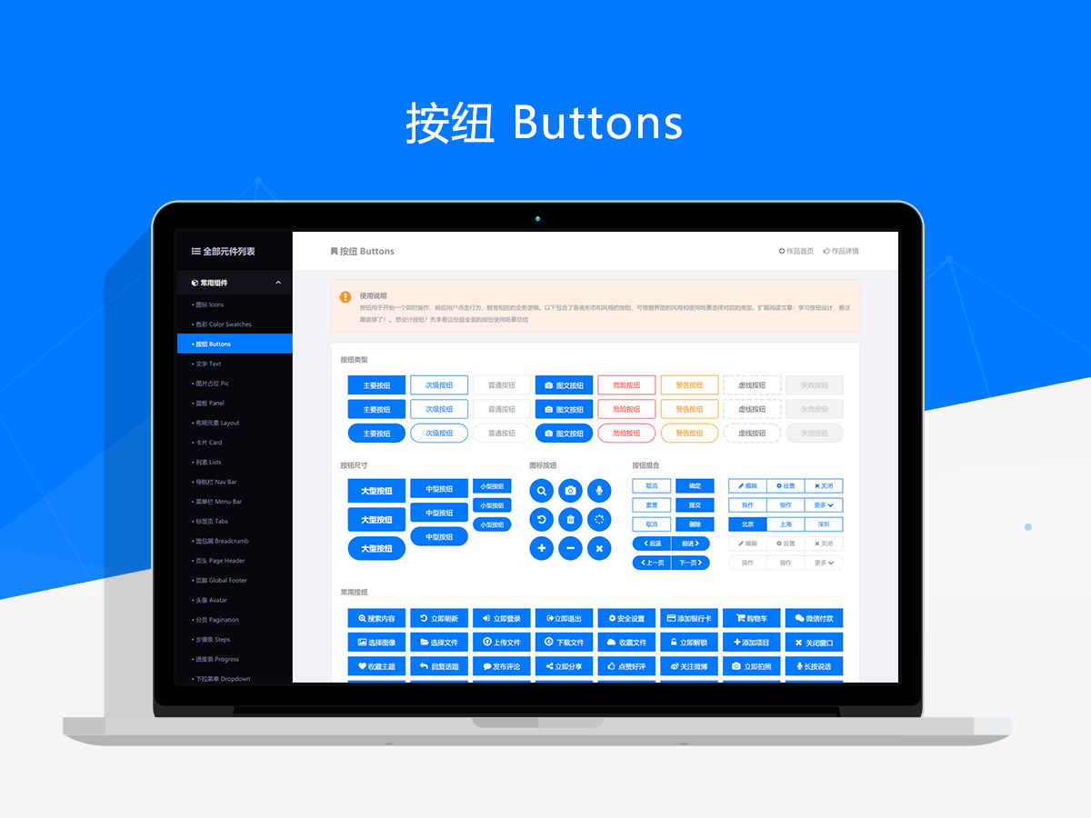
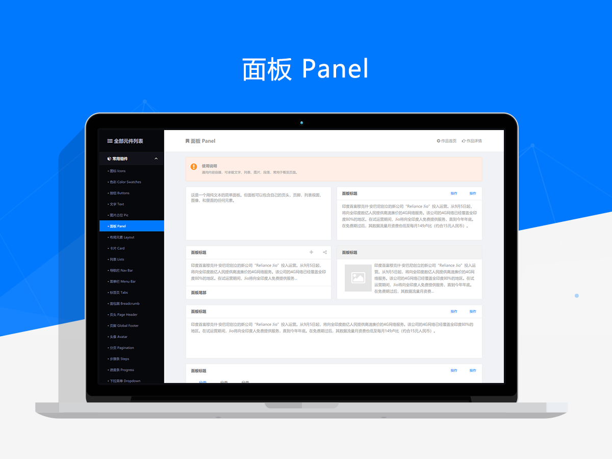
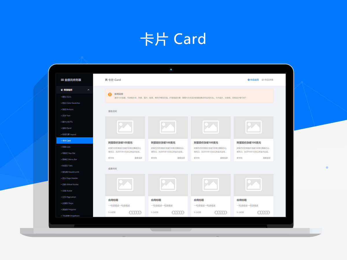
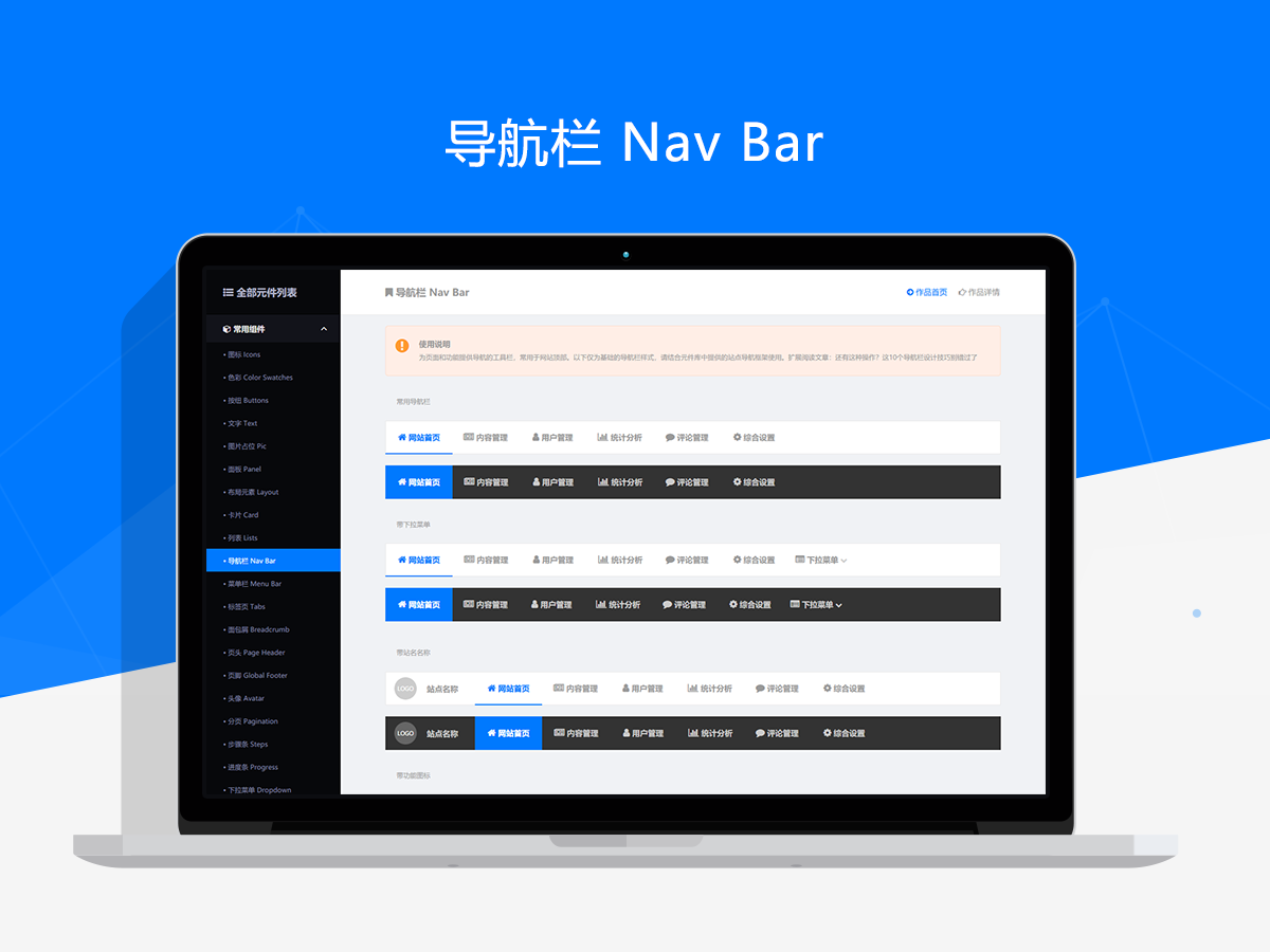
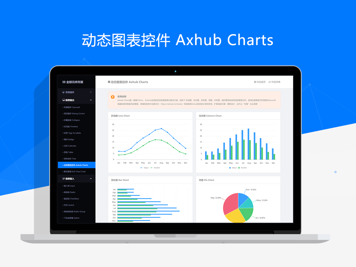
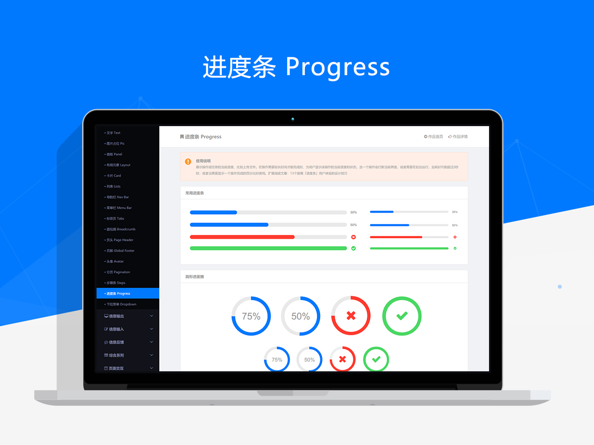
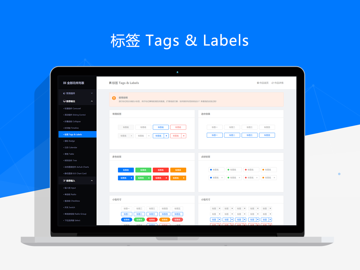
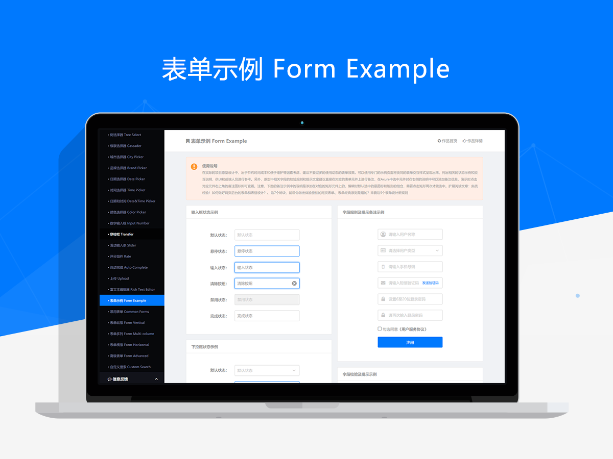
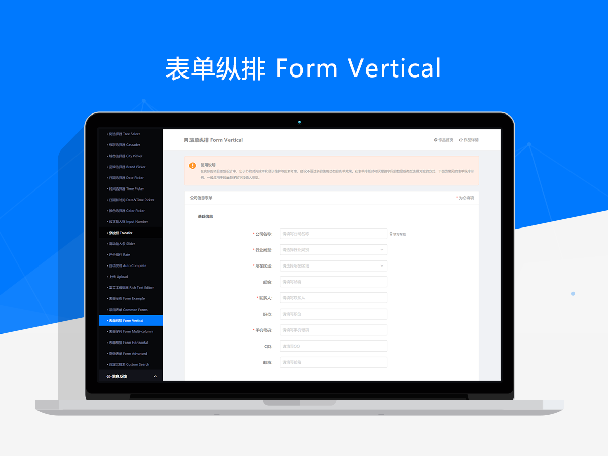
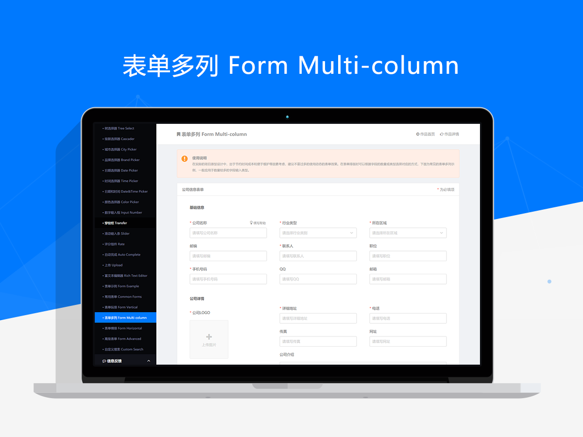
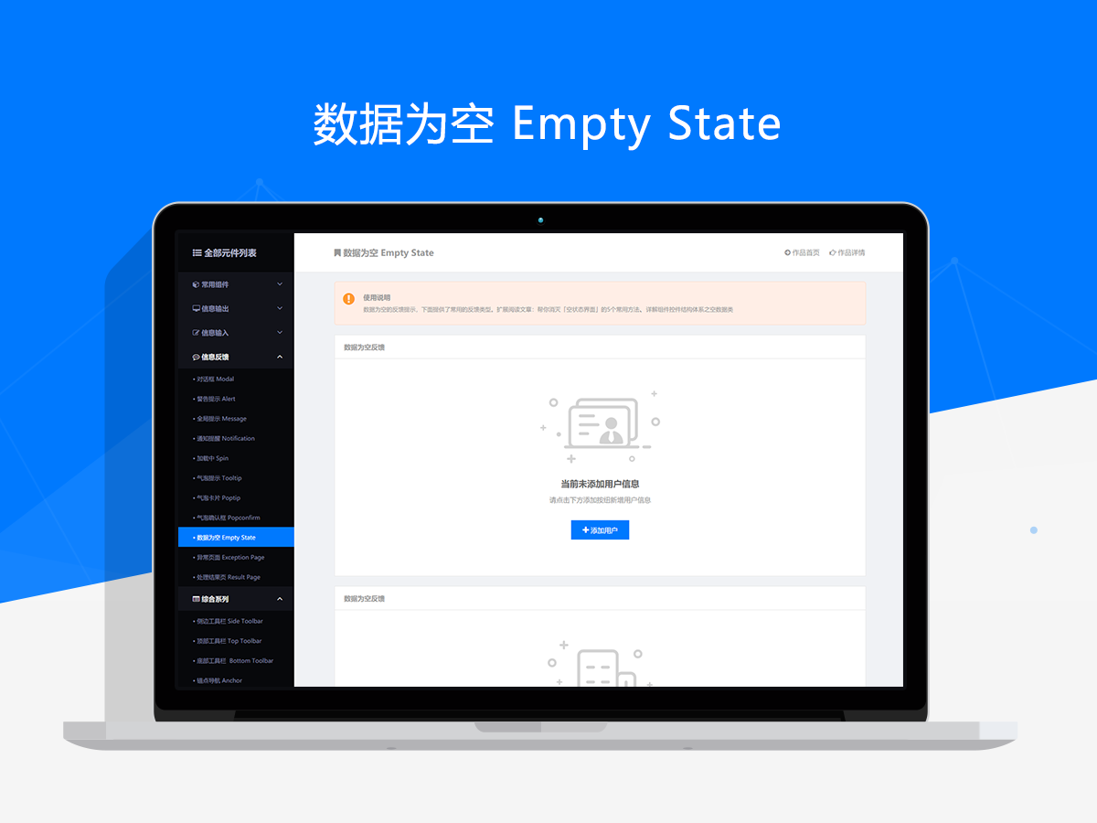
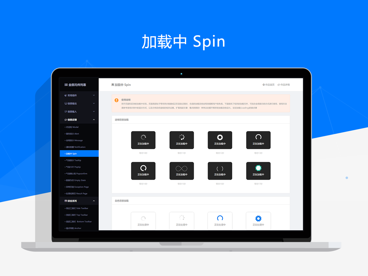
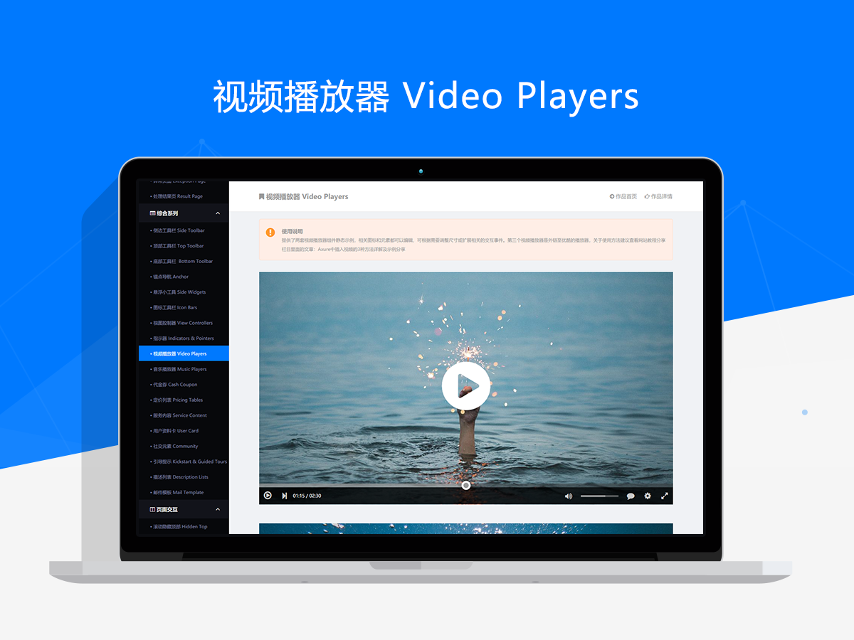
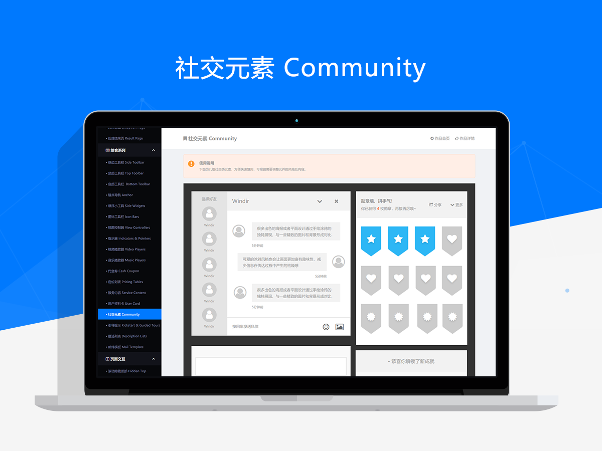
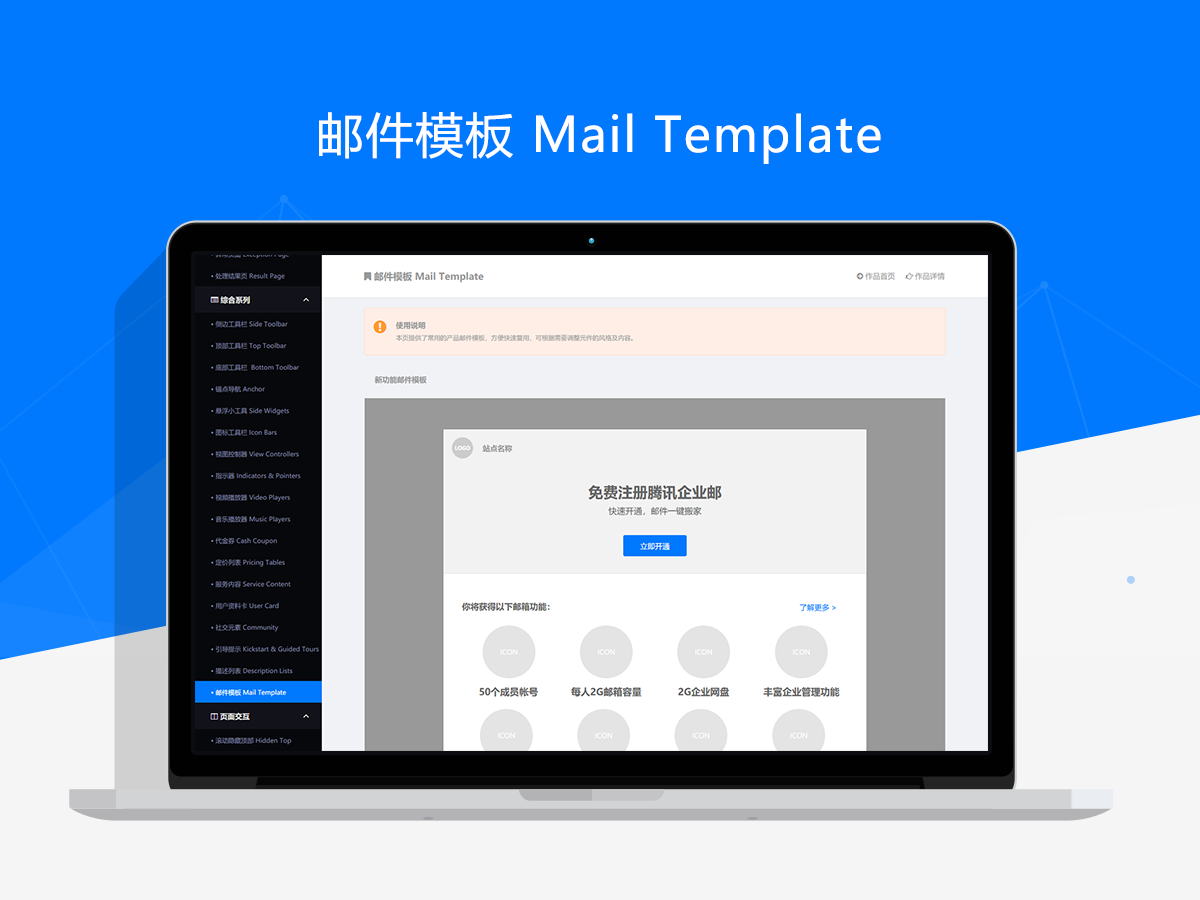
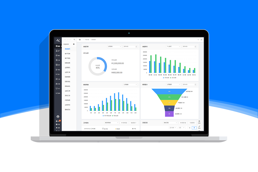
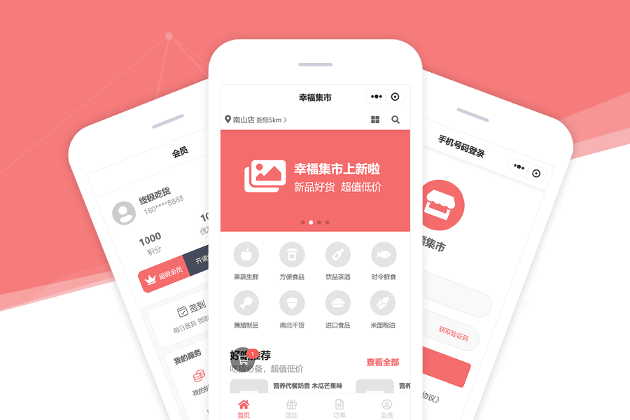
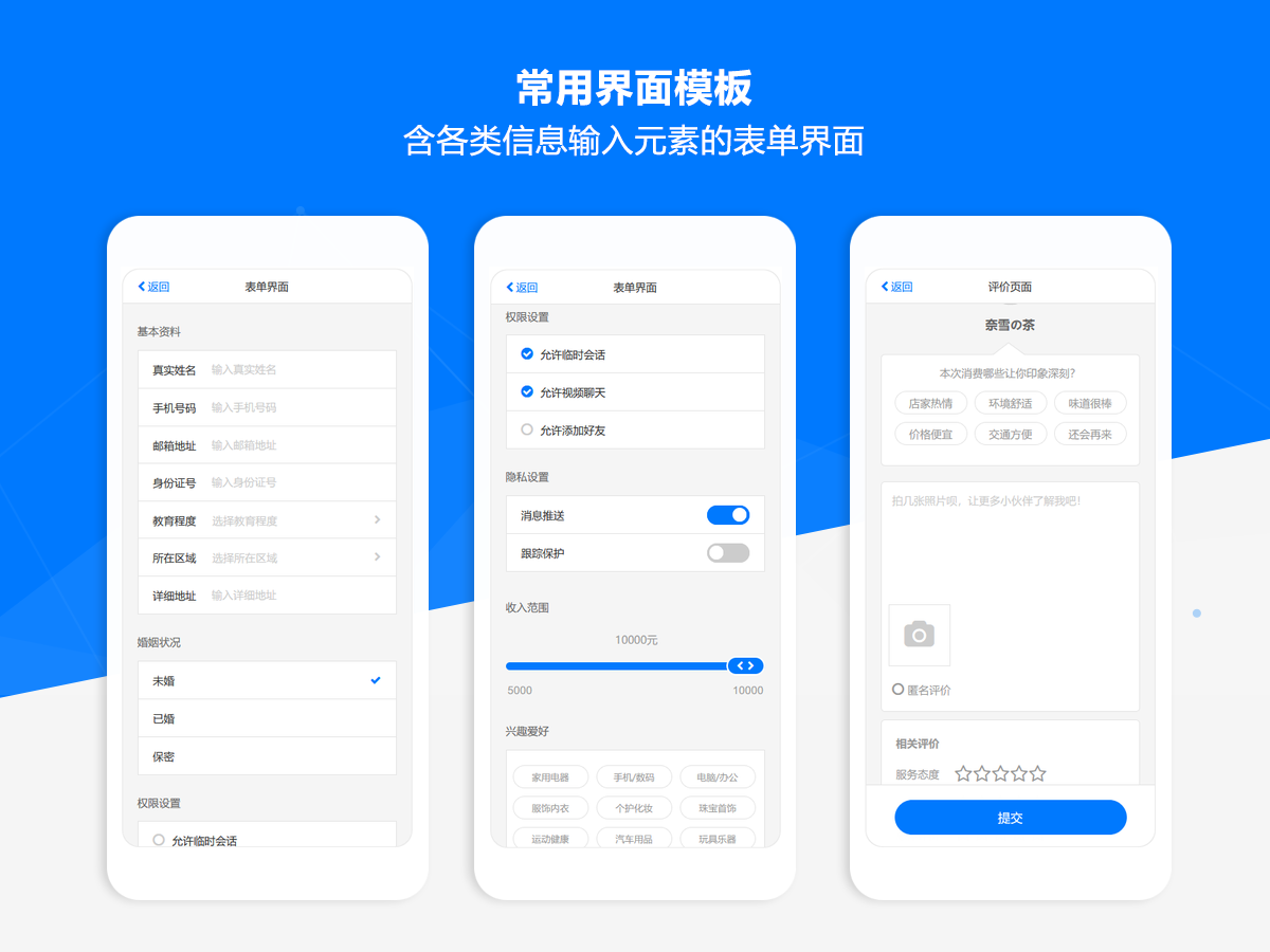
The Axure PR front-end and back-end interaction prototype web component library material source files include six component categories: commonly used components, information output, information input, information feedback, comprehensive series, page interaction, etc. These categories consist of nearly a hundred component types and thousands of independent components. Compared to the old version, the new version includes a richer variety of component types and business components, and removes some less practical components. At the same time, the new version adopts a brand new design style and color scheme, using the safer blue as the main color tone, while simplifying the color matching of related elements, making it more convenient to adjust.
In order to meet a wider range of usage needs, most of the component types in the work are provided with static and dynamic versions, and corresponding versions can be selected according to collaboration needs during use. In addition, each dynamic component provides corresponding usage examples. In order to improve the usability of dynamic interactive components, some global components are encapsulated using the master version as much as possible, and can be quickly applied to your prototype solution by simply copying and pasting. For the dynamic interaction components that are difficult to implement in Axure, the work also provides complete static examples, which can be presented on a dedicated example page and accompanied by relevant interaction instructions for UI and front-end personnel to refer to.
A perfect component library should not only consist of independent components, but also have guiding value in outputting design specifications and standards. So the new work not only improves usability and usability, but also provides many standardized usage suggestions and references. At the same time, each component type has detailed introductions and usage instructions, and related interaction specifications and user experience articles are shared in association. Therefore, this set of works is not only a practical component library, but also a comprehensive guide for interaction prototype design.
This set of works also provides multiple mainstream website layout framework templates, which are the application of AxureUX component library design methods and related specifications, and can serve as excellent reference cases for learning prototype design. At the same time, based on these templates, it can also help you quickly create prototype solutions, greatly improving the efficiency of prototype design. Each set of templates includes commonly used pages such as homepage, category page, content details, user center, registration and login, password recovery, etc. The structure of all pages is clear and reasonable, and the master version is fully utilized for modular layout, which is very easy to reuse and modify quickly. By combining the rich types of components or business components provided in the components, you can quickly design web interaction prototypes that are aesthetically pleasing, standardized, and easy to read, allowing you to focus more on functional processes and business logic. Note that the relevant templates mainly provide framework and layout references, and the completion level of each template's page may vary.
Screenshot
Copyright
Article Source: https://www.axuretheme.com/jingxuan/22.html

